 Skip to content
 The brand design is a creative and strategic journey that goes far beyond simple logos or color schemes. It is the visual soul of a company, communicating its essence and values to the world.
A professional and consistent brand design is essential for building consumer trust. When a brand presents a well-planned, attractive, and consistent visual, it conveys a message of reliability and professionalism. This is crucial for gaining customer trust, especially in competitive markets. A well-executed design makes the brand appear more established and trustworthy, encouraging consumers to choose it over others with a less polished visual presentation.
A brand with structured design benefits from the creation of a stronger identity. Visual consistency, combined with unique and memorable elements, helps to create a distinctive identity that stands out in the minds of consumers. This is essential for building a recognizable and memorable brand. The strength of a well-defined visual identity lies in its ability to instantly evoke the essence of the brand, which is an invaluable asset in building a lasting relationship with the audience.
Good brand design is crucial for effective communication with the target audience. It not only conveys the brand message clearly and concisely, but also ensures that this message is received as intended. Well-designed visual elements – such as colors, typography, and images – can communicate emotions and values without the need for words. This facilitates audience engagement and the transmission of the brand message in a more direct and impactful way, resulting in more efficient and effective communication.
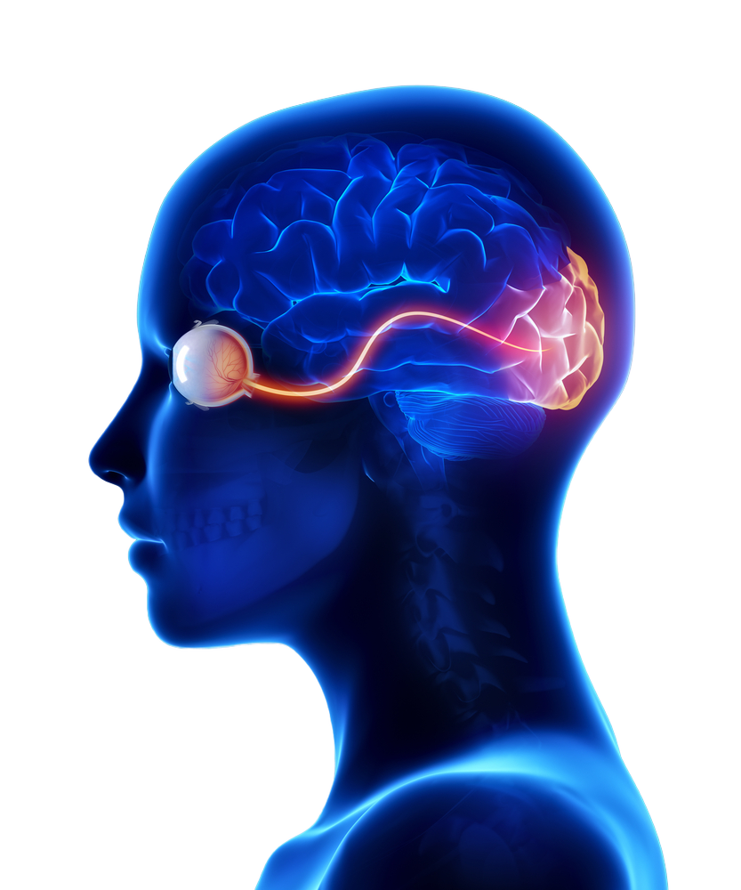
When an individual encounters a sign, the brain activates various areas responsible for visual processing, memory, and emotion. For example, a logo can activate memories associated with past experiences with the brand, while colors and shapes can trigger specific emotional responses. This processing happens almost instantly, often without the individual being consciously aware of it.
Effective signs are those that create strong emotional connections with the audience. For example, a logo that combines warm colors and rounded shapes can evoke feelings of comfort and security. This aspect is crucial in brand design, as emotions play a significant role in purchase decisions and brand loyalty.
É importante notar que a interpretação dos signos pode variar significativamente de acordo com a cultura. O que evoca uma resposta positiva em uma cultura pode não ter o mesmo efeito em outra. Portanto, ao criar signos para uma marca, é essencial considerar o contexto cultural do público-alvo.
Um exemplo clássico de como o design de marca contribui para o reconhecimento é a Apple. Com sua maçã mordida icônica, a Apple criou um logotipo tão reconhecível que não precisa nem do nome da empresa para ser identificado. Este design simplista, mas poderoso, ajuda a marca a ser lembrada e reconhecida em todo o mundo. Em qualquer lugar que você veja esse símbolo, imediatamente associa-o à inovação, qualidade e design moderno – características centrais da Apple.

Coca-Cola is a notable example of differentiation through brand design. Its cursive logo and vibrant red color are distinct and immediately recognizable. In a market filled with carbonated beverages, Coca-Cola’s visual identity stands out, creating a unique image that is difficult to imitate or confuse with competitors. This design helps Coca-Cola maintain a dominant position in the market despite strong competition.
Nike, with its famous “Swoosh,” is an excellent example of how brand design can communicate the values and personality of a company. The “Swoosh” symbolizes movement, speed, and dynamism, values that are at the heart of Nike as a sports brand. Furthermore, the slogan “Just Do It” reinforces this idea of action and overcoming challenges. These effective design and slogan help Nike convey its mission of inspiring athletes and ordinary people to achieve their full potential.
In this stage, it’s essential to identify which archetype best represents the brand essence. For example, a brand positioning itself as innovative and visionary can align with the “Magician” archetype, seeking to transform and inspire through its innovations. Research should focus on understanding how this archetype resonates with the target audience and differentiates from the competition.
After defining the archetype, the brand strategy should be molded around it. For example, a brand adopting the “Hero” archetype will focus on overcoming challenges, strength, and courage in its narrative. The strategy should reflect how the brand can incorporate these qualities into its communication and actions.
Visual development should capture the essence of the chosen archetype. If the brand is associated with the “Caregiver” archetype, for example, its design should evoke feelings of safety, caring, and support, using colors, shapes, and images that reflect these values.
In the implementation phase, it’s crucial that all customer touchpoints reflect the archetype consistently. For a “Creator” archetype, this could mean emphasizing creativity and innovation in all marketing materials and points of sale.
Finally, continuous evaluation and adjustments should consider whether the archetype is effectively communicated and resonating with the audience. A brand with an “Explorer” archetype, for example, should constantly check whether its message of adventure and discovery is reaching and engaging its target audience appropriately.
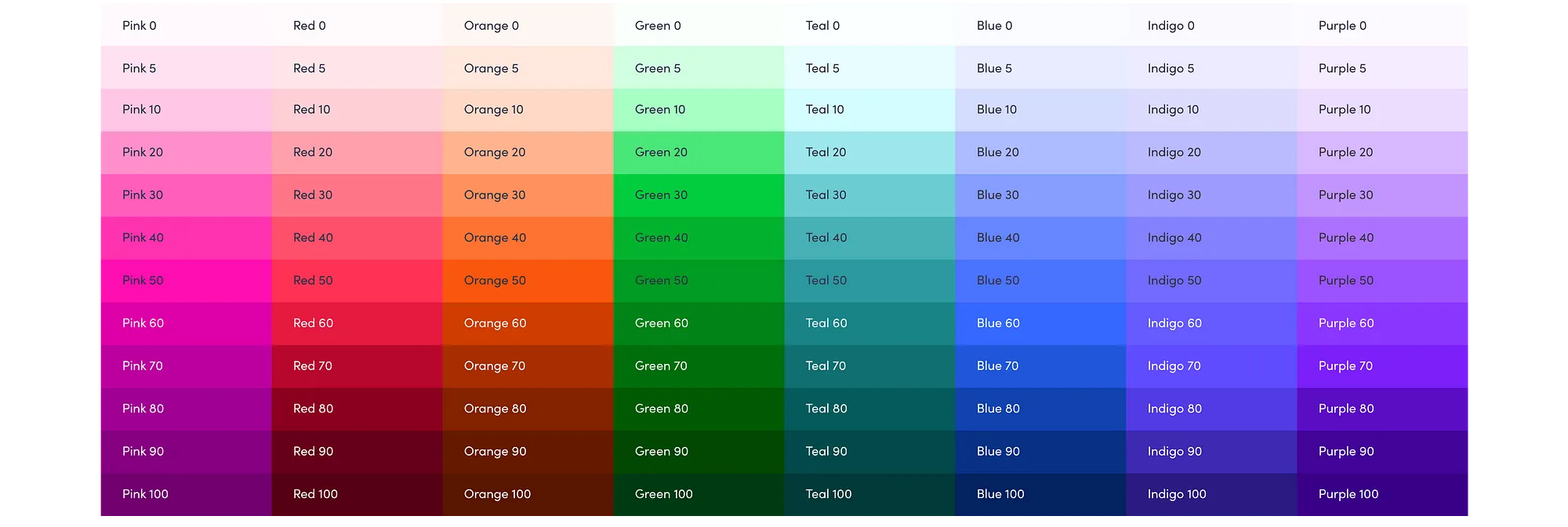
Colors have a significant impact on how we feel and perceive the world around us. Each color can evoke different emotions and reactions, making it a powerful tool in branding and design. Here are some common colors and how they are generally interpreted:
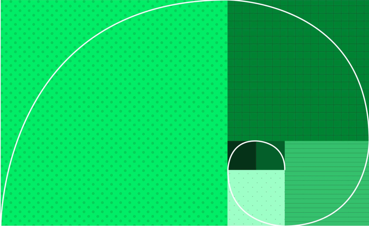
When creating a color palette for a brand, it is not enough to simply choose colors that look good together; it is also important to consider the mathematical proportions for effective visual harmony. A common technique is the 60-30-10 rule, often used in interior design and which can be adapted for brand design:
This rule helps create visual balance, ensuring that no color overly dominates the design and that there is a pleasing distribution to the eye. It is important to note that the exact proportion may vary depending on the specific brand identity and desired impact.

Typography is an essential component in brand design, playing a crucial role in communicating the brand’s identity and values. Let’s explore choices, proportions, and techniques related to typography.
The font choice should reflect the brand’s personality and be appropriate for the target audience. There are various font styles, each conveying a different message:
Typographic proportions involve adjusting font size, letter spacing (tracking), and line spacing (leading) to ensure readability and visual harmony. Good typographic design should be easy to read and pleasing to the eye. For example, larger line spacing can improve readability in long texts, while fine-tuning letter spacing can help avoid visual “holes” in texts.
There are hundreds of different software on the market that allow companies and teams to organize their work. But Trello is a simple solution that offers a free plan.
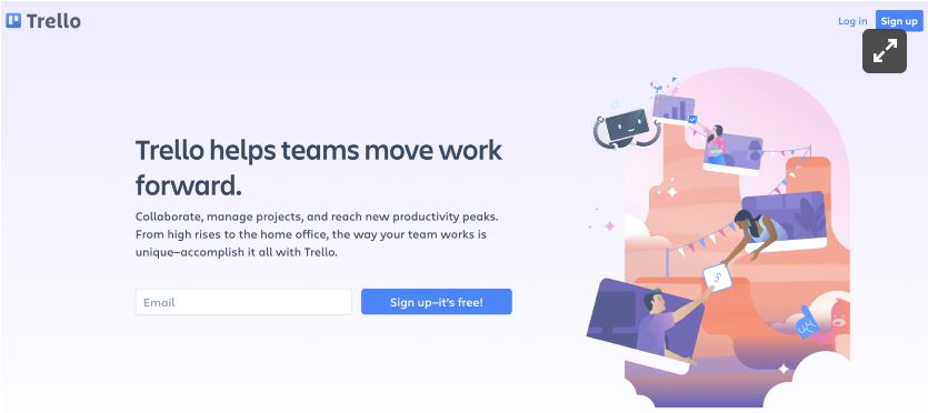
What they sell: A visual tool for managing projects, workflows, and tasks.
How it’s helpful: It streamlines project organization for multiple parties within a company, helping everyone track benchmarks and stay on the same page.
How it stands out from competitors: Trello quickly organizes tasks and deadlines into an easy-to-understand visual card format. Plus, the base version is free and shareable with anyone within an organization.
Is their proposition communicated simplistically? Yes, it is easy for people to understand right off the bat. The subhead addresses doing away with outdated project management practices that can oftentimes be a headache. This tells customers how directly Trello will make their lives easier while implying it will save time for their entire team.
You will be redirect to our server

As Cinco Forças de Porter é uma metodologia que analisa o ambiente competitivo de uma empresa, focando em cinco fatores-chave: o poder de negociação dos fornecedores, o poder de negociação dos compradores, a ameaça de produtos ou serviços substitutos, a ameaça de entrada de novos concorrentes e a rivalidade entre os concorrentes existentes. Essa abordagem, eficaz para entender as dinâmicas da indústria, permite a empresa avaliar as forças que afetam sua competitividade.
Your opinion is very important to us!
Here we will develop the color palette and typography, crucial elements in a brand’s visual identity. The palette establishes the color language, modulating consumer perceptions and feelings. Typography, on the other hand, enhances communication, ensuring clarity and evoking the brand’s personality. Both components strengthen the corporate image, promoting consistency and recognition in the market.


The brand manifesto is a strategic document that articulates an organization’s philosophy, values and intrinsic objectives. It transcends advertising, providing internal guidelines for decision-making and brand behavior. It is an essential tool for ensuring alignment and cohesion in all the brand’s interactions, consolidating its position and promoting recognition in the market. Through it, a clear commitment is established with stakeholders, strengthening the organization’s value proposition.
Methodology that creates a detailed representation of the ideal customer. This allows us to understand the various factors that lead the public to buy. We apply internal layers of understanding, which provide an in-depth view of what the avatar is looking for, how they are looking for it and why they are looking for it, in order to build an in-depth relationship strategy.


A methodology that strengthens brands, companies and teams by defining a company’s purpose. It guides the company towards its reason for existing, giving light to what will generate value. The first step in developing a company and brand positioning, which focuses on the inner layers and paves the way for truly effective communication.
The methodology connects your company to the archetypes of the collective unconscious. It facilitates the construction of an authentic identity that is deeply connected with the target audience. By assigning an archetype to your brand, you create a coherent and emotionally impactful narrative that activates your audience’s instincts and desires.
Conectar empresas a seus objetivos de expansão, impulsionando resultados transformadores, potencializando o sucesso dos negócios por meio de metas alinhadas e parcerias promissoras.
Através da compreensão dos objetivos de expansão da empresa, desenvolvemos um roadmap de atuação e contamos com uma equipe de profissionais seniores altamente comprometida, oferecendo um processo integrado e personalizado para atendimento dos objetivos de médio e longo prazo.
Desenvolvemos projetos de marketing, tecnologia e inovação que geram valor, aceleram resultados e fortalecem o propósito das empresas de pequeno e médio porte.
O PROBLEMA:
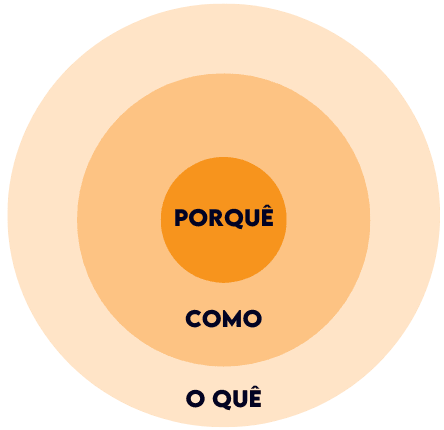
Grande parte das empresas não tem clareza dos seus objetivos, não identifica facilmente oportunidades de expansão ou se perdem na priorização do O QUE e PORQUE aquilo deve ser feito. Assim ideias e projetos facilmente são deixados para trás.
NOSSA SOLUÇÃO:
Nós criamos um ROADMAP ou entramos acelerando um planejamento existente. Atendemos empresas com soluções de marketing e tecnologia de forma integrada e programada. Agregamos e analisamos dados, em cada parte do percurso, para garantir saúde financeira e resultados escalaveis.
Desenvolvida com os mais refinados prompts de grandes consultorias, para guiar na construção do propósito, avatar de sucesso e proposta única de valor.
Consultorias aplicadas em 30 dias nas seguintes áreas.
Em 24 reuniões estratégicas, auxiliamos na implementação de novas estratégias e testes de hipóteses.
Mentorias práticas sob análise de resultados e implementação de melhorias.
Construímos juntos um Road Map e os principais indicadores para monitoramento.
Oferecemos uma equipe de profissionais seniores que irá desenvolver uma estratégia de crescimento customizada para o seu negócio e desenvolver o dia a dia das atividades.
 Optimized by Seraphinite Accelerator